Hobart Chargers Brand Refresh Case Study

CLIENT: Hobart Chargers

PROJECT TYPE: Brand Refresh & Matchday Design System

Overview

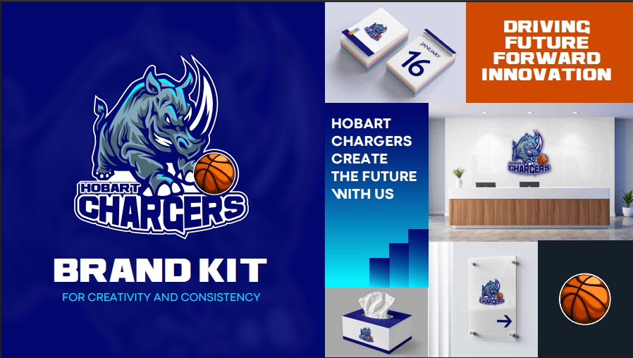
The Hobart Chargers are one of Tasmania’s most recognized basketball clubs, with deep community roots and a strong presence across game days, events, sponsors, and merchandise. The club needed a refreshed identity system that could work everywhere: from the court and social graphics to sponsorship decks and merch—while staying bold, clear, and instantly “Chargers.”

We partnered with Hobart Chargers to deliver a complete visual reboot: a new logo, a modernized brand system, an updated color palette, a suite of matchday and event templates, sponsorship deck designs, and merch mockups—giving the club a unified brand built for performance and consistency.

Background

Sports brands live in high-frequency environments: match announcements, score updates, player spotlights, sponsor shout-outs, event posters, and merch drops. Over time, that volume can cause inconsistency—especially when multiple people are creating assets quickly.

Hobart Chargers needed a sharper, more professional system that stayed recognizable across every touchpoint, and that could scale easily with the club’s content cadence.

Project Objectives

The project was built around a few clear goals:

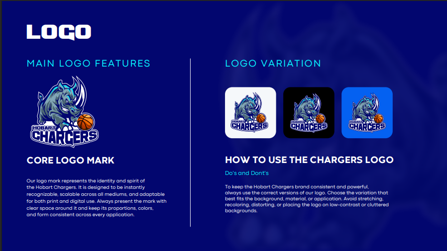
  • Create a modern, distinctive logo that feels timeless and competitive

  • Unify the brand system so every design looks like it belongs to the same club

  • Build a practical toolkit (templates + deck layouts) that speeds up production

  • Support commercial growth with polished sponsorship collateral

  • Extend the identity into merch with mockups that translate brand into product

Challenges

High-speed content needs
Matchday design demands speed—templates must look premium but be quick to update.

Consistency across channels
The brand had to work equally well on social, print, presentation decks, and apparel.

Balancing tradition with modernity
Refreshing a sports identity requires respect for existing supporters while improving clarity, versatility, and impact.

Our Solution

We approached the work as a complete brand system—not just a logo—so every asset feels connected.

1) New Logo

We designed a new logo for Hobart Chargers that is bold, legible, and versatile across digital and physical environments—built to hold up at small sizes (social/profile use) and large formats (signage, apparel, court-side).

Delivered: Primary mark + supporting lockups (where required), plus usage guidance.

2) New Branding System

To ensure consistency beyond the logo, we defined a cohesive look-and-feel across typography, layout principles, graphic elements, and compositional rules. This created a recognizable “Chargers style” that can be applied to anything—from player announcements to sponsor ads.

Delivered: Brand direction, layout language, and supporting graphic system.

3) Updated Color Palettes

We created refined color palettes to increase contrast, improve accessibility and readability, and support matchday energy while staying brand-consistent. The palette was designed to work in both digital and print contexts.

Delivered: Primary + secondary palette options and usage recommendations.

4) Match Day & Event Templates

We developed a library of templates that allow the club to move fast without sacrificing quality. Each template was built for repeatability, clarity, and flexibility—supporting common content needs like:

  • Fixtures & results

  • Score updates

  • Player spotlight graphics

  • Event promos

  • Announcements and community posts

Delivered: A consistent, easy-to-update template set designed for real matchweek workflows.

5) Sponsorship Deck Designs

We designed sponsorship deck layouts that present the club professionally and clearly—helping communicate value to partners and making it easier to pitch and renew sponsorship opportunities.

Delivered: Deck design system + slide layout library (cover, club overview, audience/value slides, packages, partner tiers, contacts).

6) Merch Mockups

To extend the identity into physical product, we created merch mockups to visualize how the new branding translates into apparel and supporter gear—ensuring the logo, palette, and graphics feel strong off-screen.

Delivered: Branded merchandise mockups for internal alignment and stakeholder buy-in.

Impact & Results (metrics to insert)

Once you share outcomes, this section can be made highly specific (and much stronger). Typical inclusions here:

  • Sponsor deck performance (new sponsor interest, conversion, renewals)

  • Social engagement lift after template rollout

  • Faster turnaround time for matchday graphics

  • Merch interest / sales or pre-order traction

  • Internal adoption (number of people using templates, reduction in inconsistencies)

Marketing & Analytics Tools

Deliverables Summary

  • New logo

  • Brand system (visual language + guidelines)

  • New color palette(s)

  • Matchday & event template suite

  • Sponsorship deck designs

  • Merchandise mockups

Conclusion

This project gave Hobart Chargers a complete identity system designed for the realities of modern sport—fast content cycles, multi-channel visibility, and sponsor-facing professionalism. The result is a unified, confident brand that looks consistent everywhere, scales effortlessly, and supports the club’s growth on and off the court.

Content Table

Overview
Background
Project Objectives
Challenges
Our Solution
Impact & Results
Deliverables Summary
Conclusion

Ready to Grow Your Business?

Recent Projects